this was a simple shape but i wanted to add the star inside the reason i wanted to do it was because i wanted to try a combined logo design, i did this on illustrator by first creating the hexagon and then with the star i wanted to add an effect to break up the block colours so i add a blur. i think that this logo design works and with text added it would start to take shape.
i wouldn't want to use this as my logo as i don't think it resembles what my album is about and the music, because its basic and also the shape doesn't work with my idea, also i would have to change the colors for it to work maybe to more of a yellow and orange to resemble summer also these colors don't work well together because they dont join together they are too separate and a logo should come together and represent the business, it also lacks a lot of timeless elements for example its just a basic shape and doesn't resemble anything. i think this logo shape would be better for maybe a children's company.
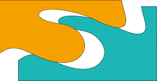
i really like this shape design, because the colours go well together, when i created this logo i saw the yellow as being the sun in the summer and the blue as being water because alot of people like to go swimming so to me this logo colours works for representing my summer album, also the cut between the two shapes, have been used a lot in existing logos its also timeless the design and that's the most important thing with a logo it should never go out of date. also by having it cut it allows an extra colour to be used or more type to be added, this logo is very flexible which is what i like about it.

the thing that i don't like so much about it is that to me it doesn't represent my album, although it has the right colours for summer, my album is about pop music and young female singers and i think it lacks the wow factor in as much as it doesn't pop out when you look at it, although by adding more effects for example 3d effect and changing the colours around and adding text, i think this experiment has been really helpful by showing me what looks good and giving me the basics in order to make it even better.
this is a great basic logo shape and i think that with a bit of tweaking it would really work also what i like about this is the colours the rich pink would fit my brand exactly and the blue complements it perfectly making the shape come together and that's what iv been looking to achieve in these basic experiments, i think that if i moved the circles more into the rectangle then it would work perfectly with type in the box and pictures or objects in the circle.
 so far this is the best logo shape that i have done that works best with my album, i would need to work on it and add text but for the basics this looks perfect. i also think that the simple aspect of it is great because a logo should be too busy and it should get the message across quickly and effectively and i think this logo shape does that which makes it work.
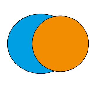
this shape with the two circles is basic but what i do like about it is that it is very versatile and it has the ability to becomes a lot of different things, and this logo shape by simply changing the changing the colours around can be used for a lot of different logos which is why this works because logos need to have that factor of being able to be flexible and work in more than one way, doing this shape has made me see that the most simple and basic ideas are what works the most. by changing the colours slightly this would also work for my album cover, which is what makes it so versatile and makes it work so perfectly.
overall all of these separate shapes for logos have all worked in their own way and i think that from doing this i can see parts from every shape that would make a great logo design. and this experiment with shapes have really helped me to see what i need to do and what parts work and don't. i now feel that i can personalize my logos more to make them work even more.
overall all of these separate shapes for logos have all worked in their own way and i think that from doing this i can see parts from every shape that would make a great logo design. and this experiment with shapes have really helped me to see what i need to do and what parts work and don't. i now feel that i can personalize my logos more to make them work even more.


No comments:
Post a Comment