
Friday 28 September 2012
research photos for cheryl cole
research photos for little mix

Tuesday 25 September 2012
inner booklet designs !!!

this was my design with a simple linner booklet that was created with the basic staple design. i used the standard measurements 12cm by 24, and did that on four pieces of paper. and then folded the paper in half and stapled the middle of the book to create the basic inner booklet.
 i think that this worked really well and i also liked the idea of using tracing paper because then i could add lyrics onto the tracing paper and having images behind on the paper. i also think it works well because the book is very well kept together as it has been stapled. the thing that i don't like about this design is that it looks too basic for my inner booklet i want it to be different and stand out from other booklets, i would also have to change the paper i used, i could use high gloss paper because that would have a more high profile looks which would fit better with my artist for example cheryl cole has a lot of high production when it comes to her albums so i would want to keep in order with that.

 this was another booklet design that i did, this was done by using string to attach the pages together, i did the same thing that i did with the other booklet i used four pieces of paper with the same measurements. but instead of using staples i used string and i did this by first folding the paper in half and then piercing three holes in the middle and then threaded string through and tied it around the back of the booklet in a bow.
i really like this design because the string adds to the design instead of just using staples and i think it has a natural effect, and gives the booklet a more personal feel. i think that this would work really well for the band little mix because they are very homely and have an innocent appeal to them, so the string would be a really nice touch for them.
the downside about this design is that its not very strong and also it still doesn't have the wow factor that i want to have for my album. this design is much more personal and natural then a normal inner booklet design for example cheryl cole.
 but overal i think that the design worked really well and if i was to chose little mix as my band then i think it would work perfectly as it looks really cute and the personal touch of the bow an string would fit the band really well, doing this design also taught me a new skill as iv never created a booklet by using string so it has taught me something by doing it as well.
i really like this idea and what i like about it even better is that you could use so many different materials for example instead of using an elastic band i could use thread or different colour elastic bands to fit into my theme and for example if i did little mix i would use different colour elastic bands because their image is very colourful and that way it would fit into the theme of the band,

i dont know if i would chose to do this for my inner booklet because i think i want my theme to be more high profile and high production to it, but i do think this design works well and also doesnt have many negatives the only negative i found was that i would have to use strong paper like card because the elastic bands can make the paper bend and not stay straight which could be a problem and also take away from the design.

i think this design was the best design that i created out of all the designs i have done, the reason is because the different size papers really makes it look amazing and i have added three holes to make sure none of the paper falls out. and i think this would be really good because i could use the different sizes to add extra information about the artist or lyrics without taking up a whole page which is what i wanted. it also adds volume to the booklet and by having the different sizes it makes the booklet much more interesting and also the fans would have alot more fun looking through the booklet. i think this worked so well and was definitly my favourt.


this is how the booklet looks when you open it from the inside, also what i like is that the different size papers and different types of paper has made the booklet look 3D when you open it out. i think i will definitely consider using this method when creating my booklet because to me it brings something different and i think it will definitely be more interesting for the fans to look at.

Sunday 23 September 2012
packaging demos !!!!!
these are some demo designs of packaging that i have created. i used a range of different materials and when designing them even though they are only demos to explore with different types of materials i was still thinking about my theme and what i want my album to possibly look like. this was a really good way for me to see how different materials look and what would work and what doesn't.

this is a melted plastic technique where i cut out different colours of plastic and made shapes with them and began to layer all the plastic together and i put a sheet of paper ontop of the plastic and then with using an ion i used the heat to make the plastic stick together.
i think that this was a really good method of creating a CD cover and its really simple but it could become much better if it was scanned in and edited on illustrator or photoshop also i think that it works for the band little mix because of all the colour and the bold colours stand out which is a lot like the theme of little mix. and i really like the layering techniques of the design with all the different colours and shapes i would definitely consider using this technique on my cover as i think it looks really good and stands out.
i don't think that there are many negatives about this design because the plastic is from plastic bags so it is easy to get the plastic and also you can make it into any design colour or shape you want so it will work any way you need it to with the colours you want.

this is the inside of the packaging. and i saw it looking like a book, with different pages when you open the cover, i wouldn't use this design because it doesn't fit in with my theme but i really like the idea of the book look but i would just design my pages different. i would have to design the pages different and also would use different materials instead of card i could use photo paper and have edited image with maybe tracing paper to cover it and have song lyrics on it.

this is another design i did, and it looks like its a parcel, i think this design is great and really works, i did this by first getting parcel paper and then rapping it around the cd cover and i added black string in the middle to keep it together and by adding stamps and different postal things it creates the effect even more. and all together i think it looks amazing and has come together really well.
the problem with this design is that its not water proof as the cover is made our of paper also if it would be made out of card then it would make it easy to damage or break. so it might not be the most convinent use of materials. i could be improved by using the same design and look but having the design within a plastic cd case to make it more protected and durable.
i wouldn't use this design because for my theme it looks too bland and also not colourful enough for my band. i could use the same type of postal design but use different colour paper and make it stand out more that would fit my theme a lot better then the simple brown paper.

this is the fabric cd cover design, i created it by using fabric and simply covered the cd case and then tied it together to create the final result. this design is really simple and it has allot of possiblitlys to it, for example the fabrics could have a print of the band or singer on it or a design that matches it to make the fabric allot more interesting. this is what makes this design so great although the limitations to the deign is that its not water proof and also it would be hard to put back together if the fan wanted to tie it back up but apart from that i think it has a really natural effect to it and looks great.
I don't think this would work for my artist because Cheryl Cole is very high profile and big production, so this would work for her brand, also if I chose to do little mix they are very pop and bold so I don't think a natural CD cover would work for them. I think to fit my theme it would need to be of higher production quality to appeal to the artists and the fans.

I think this CD cover is great it is made out of paper and i think it works really well, its simple to make and also a design that I haven't seen before so it will stand out against the rest, what I like about this design is that you have pictures and information all the way around the whole design and opened up there's even more inside so for a fan it will be very interesting to have. I also think this would work for my artists because you can have high production photos and illustrations on the design, it can be made out of many materials and you can make the design whatever you want it to look like. which makes it even better. I also love the way it opens out so it doubles as a sort of inner booklet as well as a case for the CD.
the part that I don't think works the best is that it doesn't cover the whole CD so for it to be on a shop shelf the design would have to be changed slightly because the way it is now wouldn't be suitable for it to be on a shop shelf. also I would make it out of a stronger material instead of paper to make the design more durable.

this is the back of the CD case and what I love about it is that you have the band in the corner and information on the rest of the back, it looks like a clean cut design and works really well, I think that it looks great. I would definitely consider using this as a packaging idea with better materials.

this is what the cover looks like once it has been opened up completely and I think that it looks great, because this design allows for images to be used and information or even lyrics of the songs. I think the design looks great by how its opened up and the design aspect of it works really well and I think it would be great as a CD cover and also possible double up as the inner booklet. amazing.
Wednesday 19 September 2012
Little mix Cover Idea!!!!!

i then moved everything into photoshop into one document and moved the band to look as if they they are holding up a sign with their band name on it, once i did that it still looked every edited so i added a slight blur to the whole image this just made everything murge together better and took as if it was a real photo that had been taken.
i really think that the final outcome has worked really well and looks really good, this would be good for my album cover because they look like they are having fun and they are dressed in very summery clothes so it fits in with the theme of my summer album, also having their name is very important as its an album cover the band names needs to be on it to show who they are. i chose the colours for the text because after doing research on little mix and what they prepresent on my pinterest from my research i can see that they like to have fun and use bold pop colours which is why i chose to use them colours also from my mood board on the blog there name is always in different colours so i wanted to keep my design true to their brand. also i chose the flag because they are very british and came off a british show called the factor so everything makes sense and the whole design links in with the brand. and i love the final outcome and the way it screams fun and summer this would fit perfectly.
the one thing that i don't think worked that well was that the type the word mix you cant really see the letter I if i was to do this again i would definitely change that and make the lettering clearer, another thing that i would change slightly is that when cutting out the group from an existing picture i would make the edge neater. these are thing that i would change just to make the design even more perfect. but overall I'm really happy with the outcome and love the colours and how it comes together.
Tuesday 18 September 2012
mood board for album

One. Little Mix single cover, Two. Cheryl Cole platinum Album, Three, Cheryl Cole messy little raindrops cover, Four. cheryl Cole CD, Five. Little Mix Photoshoot, Six, Cheryl Cole video Call My name, Seven. Handmade type, Eight. little mix Font, Nine. Type, Ten. my own logo that i created for my album music company called Bubble music. Eleven, my own demo design on a Little mix design for my own summer album cover.
logo designs
i created these logo designs to start to bring my ideas together more and start to personalise my logos instead of only using shapes, this really helped me to see what works and what doesn't. the first logo i did was the BCP logo above and this is a very typical logo and is seen very often but this also shows that it works and does the job. i thought a lot about the colours as i am now making the logos more true to my brand, and summer album. the reason i chose organge for B is because it stands for beyonce and the colour orange makes me think of power and strength and also hotness and thats what beyonce represents to me, the colour pink stands for cheryl cole and i chose pink because she is very girly and likes simple things and thats why i chose that colour, and finally the blue for pixie lott because i see her character as being cool and calm and laid back so all the colours have been chosen to fit the personalities of each singer.
i chose the font because it reminds my of the army and my summer album is about strength and power to women which is why i chose that font. i think that the colours and font works really well together also having them in a box brings it all together and makes it look professional thats my main aim also all the colours complement each other and i think the whole logo ties together really well and i don't really have any negatives to say about itm the only thing i would say is that i don't think that it is modern or playful enough to work right for my summer album.
overal i think that this logo fits all the aspects needed to make a good logo design and would work really well and more importantly it fits my brand and works with that and thats whats important the logo needs to link with the brand and give an idea of what its about and this is why i think that will work for my album.
this is a logo for my music company, i thought of the name bubble music because my album has all pop music and females and it relates to the artist that are on my album. this logo is a great it is a watermark and says what my company is called also the mix of colours makes the logo versatile as i can change the colours or texts very easily, its also simple it just simply spells out what my brand is and the company that also makes it timeless because the company name will never go out of fashion and will always be revelent to the business. watermarks are some of the best logos because they spell out the business and they look great but have a simple look about it. this would be a really good logo for the back of the album cover at the bottom, cause you normally get watermarks at the bottom of the cd cover so i think that this will be really good.
original logo shape designs

this was a simple shape but i wanted to add the star inside the reason i wanted to do it was because i wanted to try a combined logo design, i did this on illustrator by first creating the hexagon and then with the star i wanted to add an effect to break up the block colours so i add a blur. i think that this logo design works and with text added it would start to take shape.
i wouldn't want to use this as my logo as i don't think it resembles what my album is about and the music, because its basic and also the shape doesn't work with my idea, also i would have to change the colors for it to work maybe to more of a yellow and orange to resemble summer also these colors don't work well together because they dont join together they are too separate and a logo should come together and represent the business, it also lacks a lot of timeless elements for example its just a basic shape and doesn't resemble anything. i think this logo shape would be better for maybe a children's company.
i really like this shape design, because the colours go well together, when i created this logo i saw the yellow as being the sun in the summer and the blue as being water because alot of people like to go swimming so to me this logo colours works for representing my summer album, also the cut between the two shapes, have been used a lot in existing logos its also timeless the design and that's the most important thing with a logo it should never go out of date. also by having it cut it allows an extra colour to be used or more type to be added, this logo is very flexible which is what i like about it.

the thing that i don't like so much about it is that to me it doesn't represent my album, although it has the right colours for summer, my album is about pop music and young female singers and i think it lacks the wow factor in as much as it doesn't pop out when you look at it, although by adding more effects for example 3d effect and changing the colours around and adding text, i think this experiment has been really helpful by showing me what looks good and giving me the basics in order to make it even better.

this is a great basic logo shape and i think that with a bit of tweaking it would really work also what i like about this is the colours the rich pink would fit my brand exactly and the blue complements it perfectly making the shape come together and that's what iv been looking to achieve in these basic experiments, i think that if i moved the circles more into the rectangle then it would work perfectly with type in the box and pictures or objects in the circle.
 so far this is the best logo shape that i have done that works best with my album, i would need to work on it and add text but for the basics this looks perfect. i also think that the simple aspect of it is great because a logo should be too busy and it should get the message across quickly and effectively and i think this logo shape does that which makes it work.
this shape with the two circles is basic but what i do like about it is that it is very versatile and it has the ability to becomes a lot of different things, and this logo shape by simply changing the changing the colours around can be used for a lot of different logos which is why this works because logos need to have that factor of being able to be flexible and work in more than one way, doing this shape has made me see that the most simple and basic ideas are what works the most. by changing the colours slightly this would also work for my album cover, which is what makes it so versatile and makes it work so perfectly.
overall all of these separate shapes for logos have all worked in their own way and i think that from doing this i can see parts from every shape that would make a great logo design. and this experiment with shapes have really helped me to see what i need to do and what parts work and don't. i now feel that i can personalize my logos more to make them work even more.
overall all of these separate shapes for logos have all worked in their own way and i think that from doing this i can see parts from every shape that would make a great logo design. and this experiment with shapes have really helped me to see what i need to do and what parts work and don't. i now feel that i can personalize my logos more to make them work even more.
Wednesday 12 September 2012
magazine typography ....
this was an experiment that i did from my original type over the magazine page, i wanted to see how it would turn out and also create a different effect, i wanted to use photoshop and change different parts and take out parts to create a while new image, this will help me to see what works and what doesn't it will also be a good way for me to learn new skills.
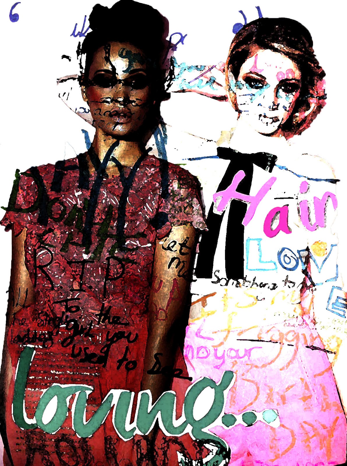
i did this by first selecting the background and taking it away, the reason i wanted to do this was because i wanted the image to look less like a whole page and only have the writing just on the models, to create the face typography. i think that this worked really well and has come more of a separate piece instead of only a page with words, by me taking out the background i think that it was given it meaning. and also i could now use that on some of the artist to create effect by doing something that you don't normally see. i also changed the exposure, on one of the models i made the exposure less and the other i over exposures it to create the contrast between the two images, that again creating an affect that i wanted to see how it would turn out.
i would definitely use this in my cd cover but not over too much of it as i think its takes away from the picture, but i think done right for example not too much writing so you can still see the design of the image underneath. but i love the contrasting effect on the design and i think they both complement each other really well and i definitely want to use these effects in my cd cover, i might not use them only on models i can use them on all different parts of it and thats what i like about find out new effects.

logo research

also from looking at the names of logos i have been able to see the reason that companies use different logos and the reasons for that, it has made me think about what would be best for the album and what one would make it stand out the most. i need to make sure that it fits the album and represents the mix tape as a whole.
i think that the word mark would be a good one for my album because its simple and clearly states what the logo is and the company which is why i think it looks really good, although as my album is a mixed tape this might not be the best because only using words will be hard to represent all the artist and the music, the emblem could be a good one as i could crete one symbol and add writing inside that stands for all the artist and music.
all the logos types could work in their own way, but i need to work out what one will best represent the album, but this has definitely taught me more about logos and the names and helped me understand the use of them more to be able to create my own effective logo.
mind map on chosen song from the summer album

this was my mind map of one of the songs and artist that will on my album. this was also a good way to express my reasons behind choosing the song and why it works with my album. i chose the album 4 by beyonce because that album has so much power and strength behind it and she represents women so greatly, she only has a full female band when she performs in concert and also the song that i chose was " i was here" because its all about leaving her mark and making a difference in the world and i think that its such a beautiful song and is so empowering.
this was also a good way to really look into the song and the artist and create a deeper meaning and let my thoughts that lay behind the song choice to be shown and it suddenly gives the album a meaning and makes it even more powering as now from doing this the songs and album, because when everything has a story behind it suddenly people feel an attachment to it and thats why i want to a add a few of these songs onto the album to create meaning.
the Brief

this is the brief that we got to create a summer album, and create our own complete cover and songs at the end. i think this a really good brief and theres a lot that i could with the brief also i like that its about summer because then it gives me the chance to use bright colours and a lot of mixed media to allow my album to really stand out, my idea for the album is i want it to come popping out of the shelf and drown out other albums, because also for me summer is all about being able to express yourself and come alive, and i want all that to come through on the cover.
the artist i will choose for my album will be pop artist they will be modern and fashionable. a few of my favourite are beyonce, cheryl cole, and little mix because they all have style and young artist, also they all have very good upbeat songs because when i think of summer i think of style and dance music and those are the artist that come to my mind when i think of those things, also artist such as pixie lott she has a lot of style and power with her, i want my album to also represent power and girl power, and beyonce is a very good artist that represents that. its going to be a mix tape that represents females and girl power.
the album is going to appeal to young fashionable people who want to listen to upbeat music and have a good time. it will also be for people who like to break the rules and be unique as my album cover will have a lot going on and have a sense of rebel to it, it will also be for people who like to socialise and chill with friends, it will be a very social album.
cheryl cole album experiments !!!!!
after creating a collage of cheryl cole, i didn't think that it was good enough for my album cover if i just left it in its original state, so i scanned it into photoshop and i began to play around with different styles and looks, i also wanted to add in some lyrics but i wanted the lyrics to represent the whole album so it had to be about summer, that is another reason why i chose to use cheryl because she has a song called under the sun which i thinks fits perfectly.
this was also a way for me to work out what word and what doesn't, so when it comes to my final album i will have a lot more knowledge of how to gain the best effects and what will show off the album best. i also like to try things iv never done and see if it works creating new looks that maybe haven't been done before will make my album stand out even more, that is what I'm always trying to achieve.
 this was the best experiment that i did for the cheryl collage, i really like the way that this has turned out, i created this by first turning cheryl into black and white, that was to create the contrast between colour and non colour, i also made the colour of the strips stand out more and make the colours more strong this was also a way of making certain things pop out instead of everything being on colour pallet. i also made the colour of the picture a lot more brighter and added exposure to the image to make it look as if the sun is really shinning down.
i added text from the cheryl cole song under the sun and i put it on the camera because to me the camera represents summer as a lot of people chose to take a lot of summer pics of holidays and days out, i chose the lyrics under the sun because everything that happens in summer is under the sun.
overal i think that this picture worked the best and i would definitely use the techniques again for my album cover.


this was also a way for me to work out what word and what doesn't, so when it comes to my final album i will have a lot more knowledge of how to gain the best effects and what will show off the album best. i also like to try things iv never done and see if it works creating new looks that maybe haven't been done before will make my album stand out even more, that is what I'm always trying to achieve.

i added text from the cheryl cole song under the sun and i put it on the camera because to me the camera represents summer as a lot of people chose to take a lot of summer pics of holidays and days out, i chose the lyrics under the sun because everything that happens in summer is under the sun.
overal i think that this picture worked the best and i would definitely use the techniques again for my album cover.

this was a really good experiment, i used the same idea i did when i created a typography photo, these were lyrics that resembled summer and all words that makes me think of summer. i don't think that i would chose this for me album cover as i think writing all over take away from the picture but i would definitely consider using texted overlay on parts of the album cover because i think it is really effect and creates the sense of layers and the words fit with the image which links everything together. this was a good way for me to see how a full page would look and find out what would work and what doesn't and play around with the effects and the outcomes so it allows me to improve all the time.

this was a quick type that i tried, i wanted to take away from the mass of type and see how the type would look if i only used big letters and not so much writing. i think that it created a good effect but i don't think that it really works that way, i think that because all the writing is so big it just takes over all the picture, and makes the image look messy, i wouldn't use this for my album cover but i would definitely play around with text and different sizes to use on the cover because thats defiantly something that i want to use, and these experiments where good practise for me to see how different styles would look. and how type either makes the image amazing or takes away from the image.
Monday 10 September 2012
My Pixie Lott drawing....
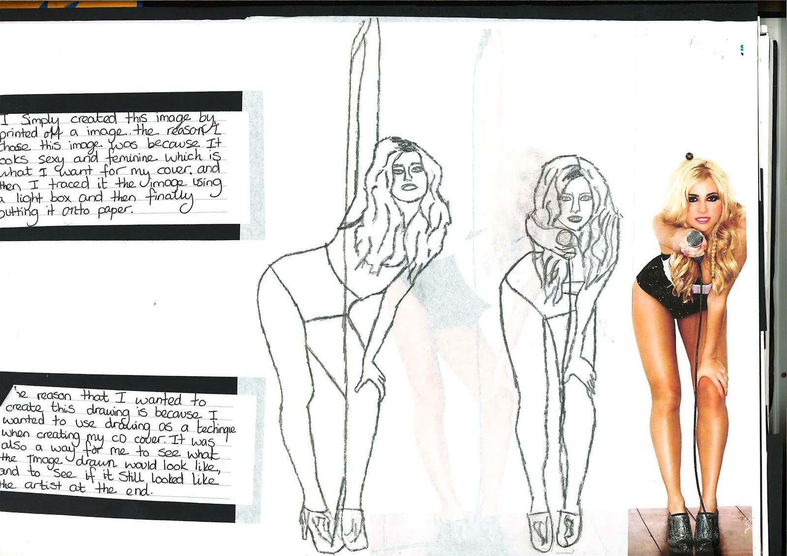
this drawing for me was a way to create a vision of the type of artist that i want in my album, and i chose pixie lott to represent them because she is young beautiful and modern, also this photo is very relevant to my theme as it shows sexiness and style and also fashion as hot pants are very in fashion right now, also the reason she is holding a mic shows the lyrics and also holding the music out to the audience its including them in the music which is what i want to do as well.

Magazine Typography

this was a typography picture that i created the reason that i wanted to chose this photo because it represents the audience that would listen to my album, they are young, fashionable and care free. thats why i thought this would be good to use.
the worlds stands for song lyrics and names of artist from album, i really like the way the writing is all over the photo because it gives it a sense of rebel and as if its breaking the rules which makes me really like it. it would be something that i would use for my album cover but instead of doing it on one photo id write over the finished album cover to create that sense of rebel that i want, i want the album cover to make a statement.
watercolour making fluid painting....


i think that this has worked really well and most of all i love the colours of the painting because it reminds me of summer, and also i think that all the colours complement each other really well, the reds and pinks remind me of long hot summer days, and the yellows remind of the sun and the blue reminds me of the cold nights that sometimes come along after the hot days and that's why iv added all them colors in the picture.
overall i think that the end result turned out really well because after using the masking fluid you can see that its the image of a face and also i love the way that the paint has made it look like the hair is flowing and that reminds me of summer and the summer breeze. i would definitely do this again and use it in other briefs and for me it a great way to just let the paint make the picture and see what you come out with.
My Mixed Media !!!!

i have already explained alot about the piece and the thought process as you can see from the picture, but i wanted to add about the fact that it was completly unplanned and how somehow the most beautiful things do come from the unknown, it was a way for me to come out of my comfort zone and go with what felt right, and that for me has been a learning curve and i would definitly do it again in the breife for it.
My Own Stitching !!!!
this piece was another way for me to experiement and also try something new. i have explained alot already in the picture, but for me this is something that i definitly want to consider for my album also because it will add texture and i dont know of any CD covers that have texture and 3D elements about them, it will definitly help make the cover stand out.
 it took a lot more time to complete then first thought, but the end result was definitely worth it and for me the colors represent love and summer for example the reds and blues, red for love and also the heat of the summer and the blue for the blue sky's and the cream is a very neutral color and most people like to wear bright and light colors in the summer and that is why i thought it would be good to use them.
but this is definitely something i want to use in the album cover.

but this is definitely something i want to use in the album cover.
still life of my summer album !!!!

the negative that i would say about this still life is next time i would like to add more objects into the photo to make the scene look busier as in the real life it would be very crazy with a lot going on, so i would add more to make it more realistic to the image and message i was trying to portray from the still life, but overall i think it has worked really well and the effect has still come across in the photo.
Drawing!!!
my drawing of the guitar was to show the musical instruments that are used to make the music and not just the singers themselves and the reason that i wanted to do a guitar was because nearly any song can be played on it and the sound can be changed so much all from that one instrument so to me it represented all the songs on the album which is what made me realize that it was a great choice.
 i dont normally like doing drawing as they are not my favorite thing to do, but this has turned out really well and i think the effect shows a simpisty about it which also stands for the music aswell because the tracks are about summer but they are also about simple things in life and happy times which in life we enjoy the most and it shows the simple and happy times people go through
doing this drawing has improved my drawing skills and iv gained more practice in improving that skill, it has also made me start to really like drawings as i normally don't choose to do drawing but this has changed my view and also a drawing combined with another maybe more colorful or edited piece would create a great mixed media piece,

doing this drawing has improved my drawing skills and iv gained more practice in improving that skill, it has also made me start to really like drawings as i normally don't choose to do drawing but this has changed my view and also a drawing combined with another maybe more colorful or edited piece would create a great mixed media piece,
MY cheryl collage....

i see the strips on the collage which i created from cutting different pages of a magazine and sticking them on, the reason i wanted to do this was because it reminded me of a flash from the camera thats also in the picture and not only that but each strip shows a memory and a photo that was taken. the lips as iv already said in the photo add effect but also it shows the gossip as people share summer memories. thats why i think that this collage worked so well because it has so meaning and screams summer which is what i wanted.
i would definitely use this method again as i think that it works really well and also is a way of expressing my thoughts behind my vision in the best way and i can make it very expressive and it work, this is my favorite part of making a collage.
Subscribe to:
Posts (Atom)