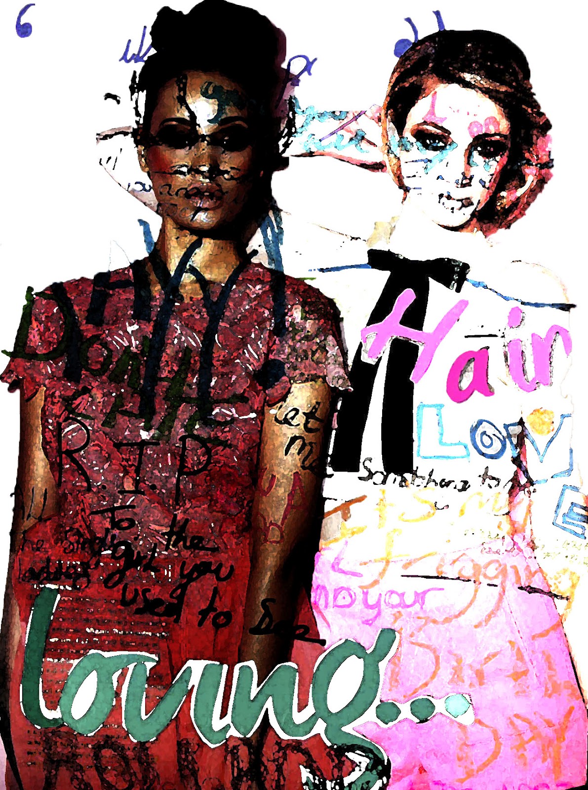
this was an experiment that i did from my original type over the magazine page, i wanted to see how it would turn out and also create a different effect, i wanted to use photoshop and change different parts and take out parts to create a while new image, this will help me to see what works and what doesn't it will also be a good way for me to learn new skills.
i did this by first selecting the background and taking it away, the reason i wanted to do this was because i wanted the image to look less like a whole page and only have the writing just on the models, to create the face typography. i think that this worked really well and has come more of a separate piece instead of only a page with words, by me taking out the background i think that it was given it meaning. and also i could now use that on some of the artist to create effect by doing something that you don't normally see. i also changed the exposure, on one of the models i made the exposure less and the other i over exposures it to create the contrast between the two images, that again creating an affect that i wanted to see how it would turn out.
i would definitely use this in my cd cover but not over too much of it as i think its takes away from the picture, but i think done right for example not too much writing so you can still see the design of the image underneath. but i love the contrasting effect on the design and i think they both complement each other really well and i definitely want to use these effects in my cd cover, i might not use them only on models i can use them on all different parts of it and thats what i like about find out new effects.

No comments:
Post a Comment