Wednesday, 12 September 2012

the Brief

this is the brief that we got to create a summer album, and create our own complete cover and songs at the end. i think this a really good brief and theres a lot that i could with the brief also i like that its about summer because then it gives me the chance to use bright colours and a lot of mixed media to allow my album to really stand out, my idea for the album is i want it to come popping out of the shelf and drown out other albums, because also for me summer is all about being able to express yourself and come alive, and i want all that to come through on the cover. 

the artist i will choose for my album will be pop artist they will be modern and fashionable. a few of my favourite are beyonce, cheryl cole, and little mix because they all have style and young artist, also they all have very good upbeat songs because when i think of summer i think of style and dance music and those are the artist that come to my mind when i think of those things, also artist such as pixie lott she has a lot of style and power with her, i want my album to also represent power and girl power, and beyonce is a very good artist that represents that. its going to be a mix tape that represents females and  girl power. 

the album is going to appeal to young fashionable people who want to listen to upbeat music and have a good time. it will also be for people who like to break the rules and be unique as my album cover will have a lot going on and have a sense of rebel to it, it will also be for people who like to socialise and chill with friends, it will be a very social album. 

cheryl cole album experiments !!!!!

after creating a collage of cheryl cole, i didn't think that it was good enough for my album cover if i just left it in its original state, so i scanned it into photoshop and i began to play around with different styles and looks, i also wanted to add in some lyrics but i wanted the lyrics to represent the whole album so it had to be about summer, that is another reason why i chose to use cheryl because she has a song called under the sun which i thinks fits perfectly.

this was also a way for me to work out what word and what doesn't, so when it comes to my final album i will have a lot more knowledge of how to gain the best effects and what will show off the album best. i also like to try things iv never done and see if it works creating new looks that maybe haven't been done before will make my album stand out even more, that is what I'm always trying to achieve.

this was the best experiment that i did for the cheryl collage, i really like the way that this has turned out, i created this by first turning cheryl into black and white, that was to create the contrast between colour and non colour, i also made the colour of the strips stand out more and make the colours more strong this was also a way of making certain things pop out instead of everything being on colour pallet. i also made the colour of the picture a lot more brighter and added exposure to the image to make it look as if the sun is really shinning down.

i added text from the cheryl cole song under the sun and i put it on the camera because to me the camera represents summer as a lot of people chose to take a lot of summer pics of holidays and days out, i chose the lyrics under the sun because everything that happens in summer is under the sun.
overal i think that this picture worked the best and i would definitely use the techniques again for my album cover.


this was a really good experiment, i used the same idea i did when i created a typography photo, these were lyrics that resembled summer and all words that makes me think of summer. i don't think that i would chose this for me album cover as i think writing all over take away from the picture but i would definitely consider using texted overlay on parts of the album cover because i think it is really effect and creates the sense of layers and the words fit with the image which links everything together. this was a good way for me to see how a full page would look and find out what would work and what doesn't and play around with the effects and the outcomes so it allows me to improve all the time. 

this was a quick type that i tried, i wanted to take away from the mass of type and see how the type would look if i only used big letters and not so much writing. i think that it created a good effect but i don't think that it really works that way, i think that because all the writing is so big it just takes over all the picture, and makes the image look messy, i wouldn't use this for my album cover but i would definitely play around with text and different sizes to use on the cover because thats defiantly something that i want to use, and these experiments where good practise for me to see how different styles would look. and how type either makes the image amazing or takes away from the image. 

Monday, 10 September 2012

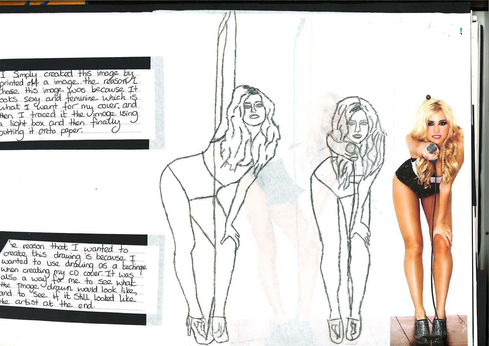
My Pixie Lott drawing....

this drawing for me was a way to create a vision of the type of artist that i want in my album, and i chose pixie lott to represent them because she is young beautiful and modern, also this photo is very relevant to my theme as it shows sexiness and style and also fashion as hot pants are very in fashion right now, also the reason she is holding a mic shows the lyrics and also holding the music out to the audience its including them in the music which is what i want to do as well. 
overal i think that its worked really well and i love the simplicity of the drawing, i think even thought its only in pencil you still get a sense of excitement and the feeling you would get if the artist was performing on stage thats what i like, the engery of the picture, as this is a summer album i want it to be fun and have a lot of engery around it. also i want it to be modern.

Magazine Typography


this was a typography picture that i created the reason that i wanted to chose this photo because it represents the audience that would listen to my album, they are young, fashionable and care free. thats why i thought this would be good to use.

the worlds stands for song lyrics and names of artist from album, i really like the way the writing is all over the photo because it gives it a sense of rebel and as if its breaking the rules which makes me really like it. it would be something that i would use for my album cover but instead of doing it on one photo id write over the finished album cover to create that sense of rebel that i want, i want the album cover to make a statement.


watercolour making fluid painting....

this was a watercolour painting that i created, it is of beyonce and the reason that i wanted to do this was because iv never used masking fluid before and it was a good way for me to learn a new skill, also it will be good experimenting for my summer album.

i think that this has worked really well and most of all i love the colours of the painting because it reminds me of summer, and also i think that all the colours complement each other really well, the reds and pinks remind me of long hot summer days, and the yellows remind of the sun and the blue reminds me of the cold nights that sometimes come along after the hot days and that's why iv added all them colors in the picture. 

overall i think that the end result turned out really well because after using the masking fluid you can see that its the image of a face and also i love the way that the paint has made it look like the hair is flowing and that reminds me of summer and the summer breeze. i would definitely do this again and use it in other briefs and for me it a great way to just let the paint make the picture and see what you come out with.


My Mixed Media !!!!

this was my mixed piece, it has come together in a very weird but amazing way, and the end result was unplanned i wanted to experiement and play around with new materials and see where it took me and i just gave it a go, to me that made the end piece even better not knowning how it was going to come out.

i have already explained alot about the piece and the thought process as you can see from the picture, but i wanted to add about the fact that it was completly unplanned and how somehow the most beautiful things do come from the unknown, it was a way for me to come out of my comfort zone and go with what felt right, and that for me has been a learning curve and i would definitly do it again in the breife for it.

My Own Stitching !!!!

this piece was another way for me to experiement and also try something new. i have explained alot already in the picture, but for me this is something that i definitly want to consider for my album also because it will add texture and i dont know of any CD covers that have texture and 3D elements about them, it will definitly help make the cover stand out.

it took a lot more time to complete then first thought, but the end result was definitely worth it and for me the colors represent love and summer for example the reds and blues, red for love and also the heat of the summer and the blue for the blue sky's and the cream is a very neutral color and most people like to wear bright and light colors in the summer and that is why i thought it would be good to use them.  

but this is definitely something i want to use in the album cover.